timday.com
- Contents
 Home
Home- Articles
- Visualisations
- Share
- Evolvotron
- Fracplanet
- Java
- Voluminium
- fbreportz
- Sudoku
- Galaxies
- Catalog
- Milky Way
- Nebulae
- WIP


Project Euler
After completing 175 Project Euler problems, I decided to take a break from them and to take stock of what I'd come through and create some visual artefacts of the journey. The results are below.
Contents: Wordles, Campaign history, Difficulty, Participants.
Images link to full size versions. Tools used: python, matplotlib, wordle, lxml & xpath, LaTeX and Beeamerposter.
Originally created February 2011; subsequent updates are noted below.
Poster
An A0 poster done for a session at work on people's CPD actitivites and "side projects".
Wordles
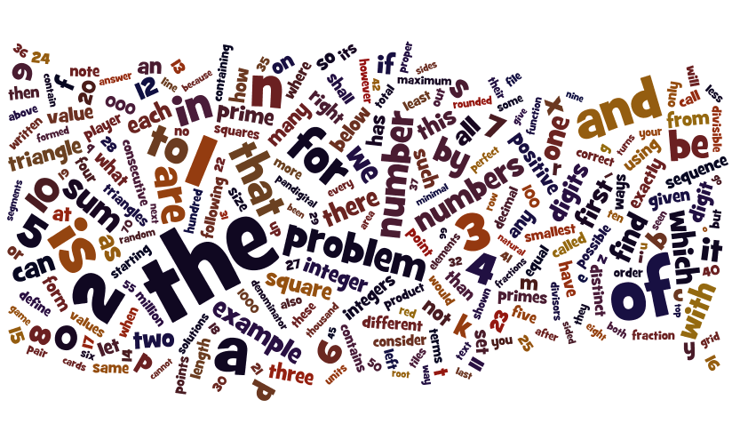
A wordle created from the source code of my Scala solutions to the first 175 Project Euler problems. With hindsight, it would have been better to preserve case.

My first attempt at a wordle of the text of the first 175 problems:
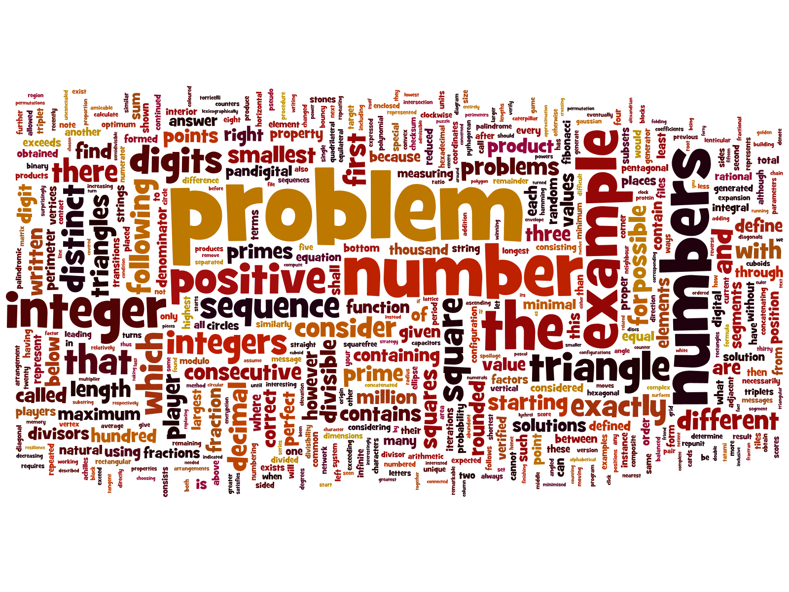
And a couple more of the text of the entire 300+ problem set follow. A fair amount of tweaking of the word-weighting function was done (making word length a factor as well as frequency) to reduce the impact of the "the" and make "problem" suitably prominent. (These two thumbnails link to 1600x1200 images intended for use as desktop backgrounds).

Above wordles can be found in this collection (if you want desktop images preserving text sharpness, use the wordle applet's "open in window" button, then fullscreen the window, to get a version at an appropriate resolution for your screen).
Campaign History
(This section updated January 2012.)
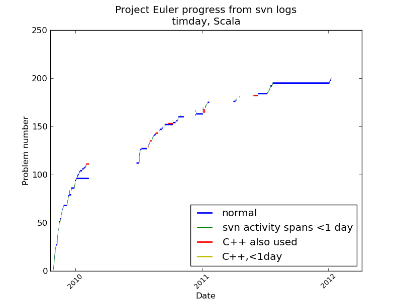
A plot created from svn logs of my solutions to the first 200 Project Euler problems. The bars show the interval between the initial and final commits for each problem's solution. You can draw your own conclusions about increasing difficulty level, and/or my enthusiasm for the campaign.
Difficulty
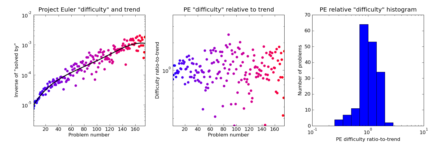
I'd also become interested in whether the difficulty rating of each problem on the Project Euler site, which is simply the number of users who've solved the problem, had much correlation with how difficult I was finding the problems. The "solved by" number is also to a large extent a measure of the popularity of a problem's subject area. With hindsight it'd have been interesting to have made some subjective 1-5 rating of difficulty after solving each problem (and also some rating of problem "quality" too... some are far more enjoyable than others) but it's too late for that now. However, some quantitative measures of my experience are available: elapsed time between first and last commits from svn, the number of svn commits and the number of lines of code in each solution.
This first exhibit is a plot of the Project Euler "solved by" number against problem number. The number is inverted to obtain a quantity which increases with difficulty. It seems to me the overall trend has more to do with people lacking sticking power and giving up after solving some tens of problems than any genuine increase in difficulty, so a a 4th order "trend" polynomial is fitted and the "relative difficulty" of each problem defined as the ratio of its difficulty to the trend. There's no particular reason for 4th order other than it seems a nicer fit than any lower degree, and I have a vague idea that since this range of problems spans 4 Project Euler "levels" there might be 4 or so "sections" to the trend. It's this "ratio-to-trend" difficulty which is compared against in the plots below.
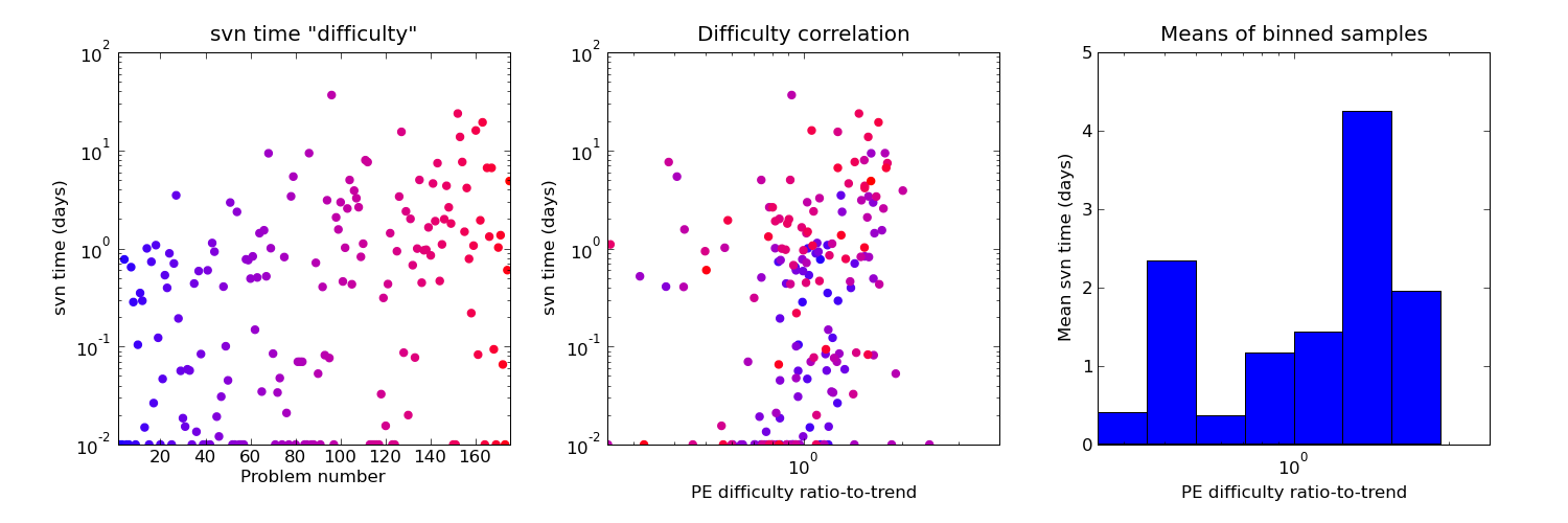
The next is my elapsed time on each problem from the svn logs. There are a lot of problems with this measure: easy problems often just have one commit (so time intervals are clamped to a minimum of 0.01 of a day to keep the log-axis plots happy), but so also do difficult problems which I worked on away from internet access to my svn repository (with hindsight, using "git" for version control could have avoided this). And of course all the other distractions of life mean that it's impossible to say how much mental time or keyboard time was actually spent on the problem in the elapsed time. Futher, for some of the more interesting problems I spent some time playing around them with after solving them and seeing other's solutions in the forums. For whatever reason, the correlation with the de-trended Project Euler derived difficulty measure seems poor, although there's certainly "something there" if only because the fastest times are far more likely to occur for below nominal "solved by" difficulty problems, while there are far more problems which took a long time to crack on the right of that scale. Binning samples and taking the means of the bins shows the "solved by" number to be a fairly dubious predictor of how long I'm likely to spend on a problem.
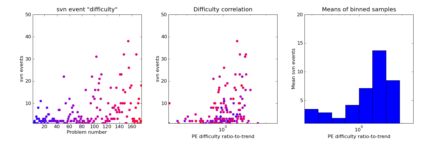
The next plot is similar to the above, except that the number of svn log records (generally commits) for each problem is compared with the "solved by" derived measure. The idea is that this number should capture the amount of work I did on the problem better than the elapsed time, and perhaps correspond to the number of false starts or mental sprints. Certainly the plot and the means of the binned samples does expose a difference between problems with above and below nominal "solved by"-derived difficulty, with those below generally only seeing a handful of commits while those above can have significantly more.
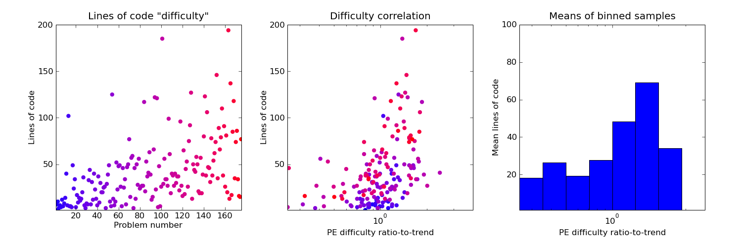
The final plot below shows lines of code (comments stripped) of my solutions compared with the "solved by" measure. Note that Scala, in the style I write it, is quite verbose and my lines-of-code counts are gargantuan compared to many solutions posted in the forums (I don't regard Project Euler as an exercise in "code golf" myself). As in the previous plot, there is a clear picture of the difficult problems needing more code.
Conclusions ? To date I've been solving problems almost strictly in numeric order. If I ever come back to it and want to increase my solved count as quickly as possible it's tempting to adopt an approach where I tackle the easiest remaining (highest "solved by") problems first. On the other hand, avoiding the temptation to "cherry pick" so far has exposed me to some difficult and very satisfying problems it would be a shame to have missed.
Participants
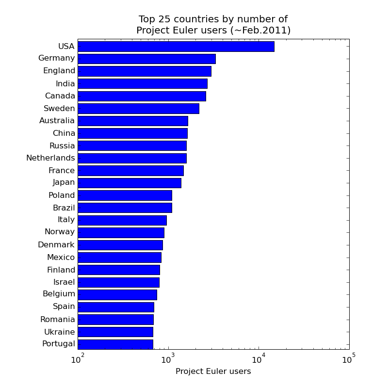
(Data gathered February 2011; obviously the results would be expected to change with time). Project Euler's statistics page reports the number of users in each country (note the log scale):
That's all very well, but it doesn't tell you which countries have the greatest proportion of their population with an interest in the project. Scraping wikipedia for country population numbers and dividing through obtains (note log scale again) this:
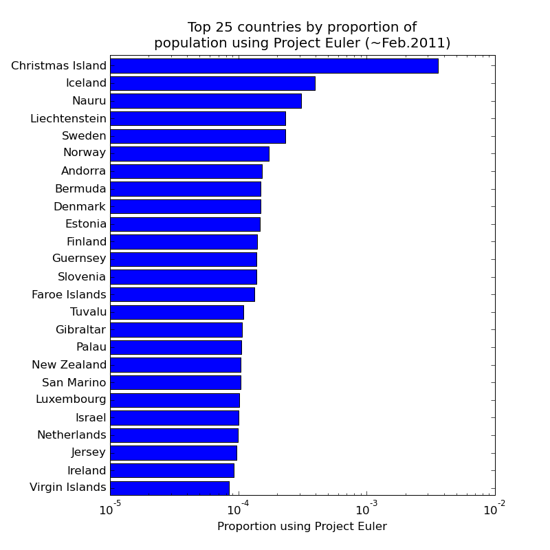
Christmas Island is there in prime position by by grace of 5 users among a population of ~1400 (although only 2 have solved more than a handful). And no, I'd never heard of Nauru either (3 users out of a population of ~14000).
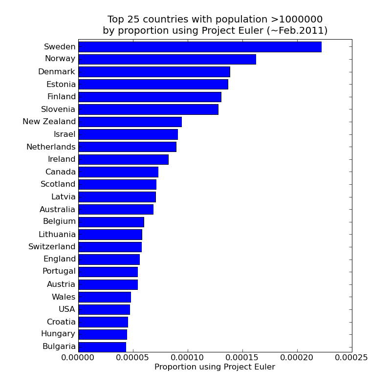
Limiting the countries considered to those with a population >1,000,000 (sorry Iceland, population ~300,000) results in this plot (dropping the log-scale this time):
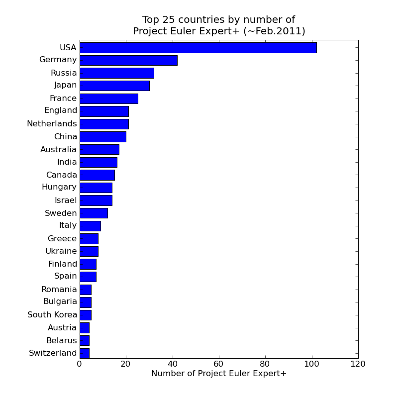
The above plots are based on Project Euler user numbers. Given the average number of problems solved per user is currently a mere 16.4 out of the 300+ available, clearly there is either a massive drop out rate or most users are just not that into it. So which countries' Project Euler participants have demonstrated real sticking power ? The next two plots are variations of those above, this time counting only the participants who have achieved Expert, Legend or Veteran status ie 200 or more problems solved. Note that in this case restricting attention to the larger countries makes no difference to the plots.
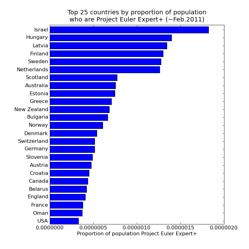
Finally, continuing the "sticking power" theme, one further plot from this data suggests itself: which countries have had the largest proportion of their Project Euler users progress to Expert+ level ? This plot only shows countries with more than 100 Project Euler users (sorry Madagascar; while having one expert out of just 3 users is impressive, I can't really consider it to be the equivalent of having 33 experts out of 100 users).


